Shifting gears
Drive Go mobile app design and development
Drive Go is New Zealand’s first learn-to-drive mobile app, enabling learners to become better drivers on our nation’s roads and setting us all up for a safer future.
The road to success
Drive Go was a multi-agency initiative from NZTA, ACC and the Ministry of Education, with the goal of achieving a generational shift in the capability of young Kiwi drivers. We worked in partnership to produce a practical tool that would increase the capability of learners and help them gain the right skills to get their licences. When it launched in 2019, Drive Go was a first-of-its-kind, richly featured product with great thinking, great content and lots of great functionality - all backed by best-practice learning principles. But this was just the beginning of the Drive Go journey…
Back behind the wheel
After a year in market we undertook a proactive review - working with data scientists, NZTA data and google analytics - and found that at every level the users strongly skewed female.
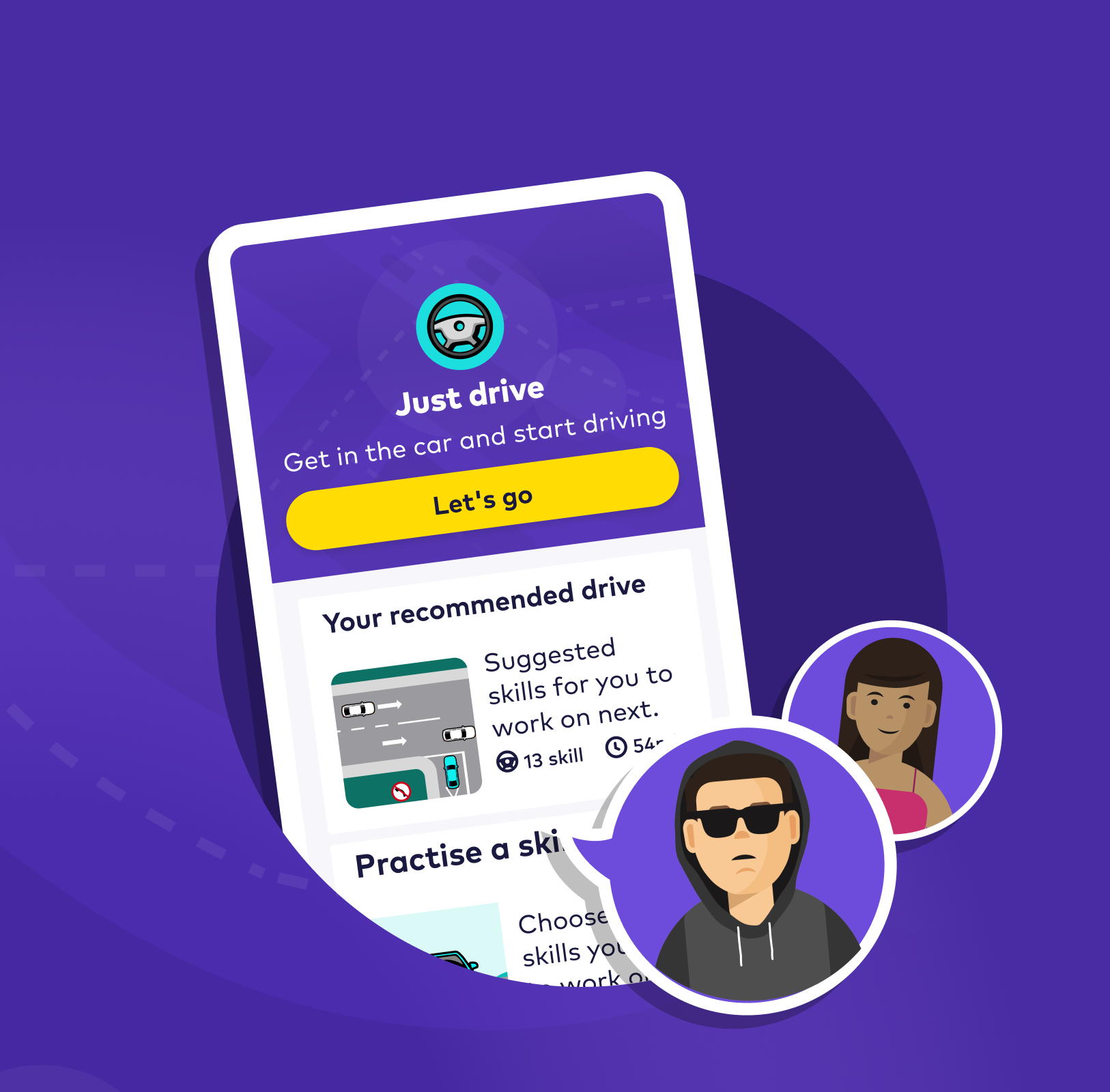
Knowing that male drivers aged 15-24 were responsible for 25% of serious crashes, we wanted to ensure the mobile app resonated in the same way with young men. This work would be critical to supporting NZTA’s new Road to Zero mission, aimed at creating a future where no one dies or is seriously injured on New Zealand roads.
Time for a tune up
Our next step was to review learning styles and user habits, analyse data around crash statistics and safety factors, and utilise a range of research techniques including focus groups and one-on-one interviews to understand the target audience. We also began co-designing in workshops with teenage boys who precisely fit the profile. To get the most from them we met them on their terms - coming to school, bearing buckets of KFC of course!
Pedal to the metal
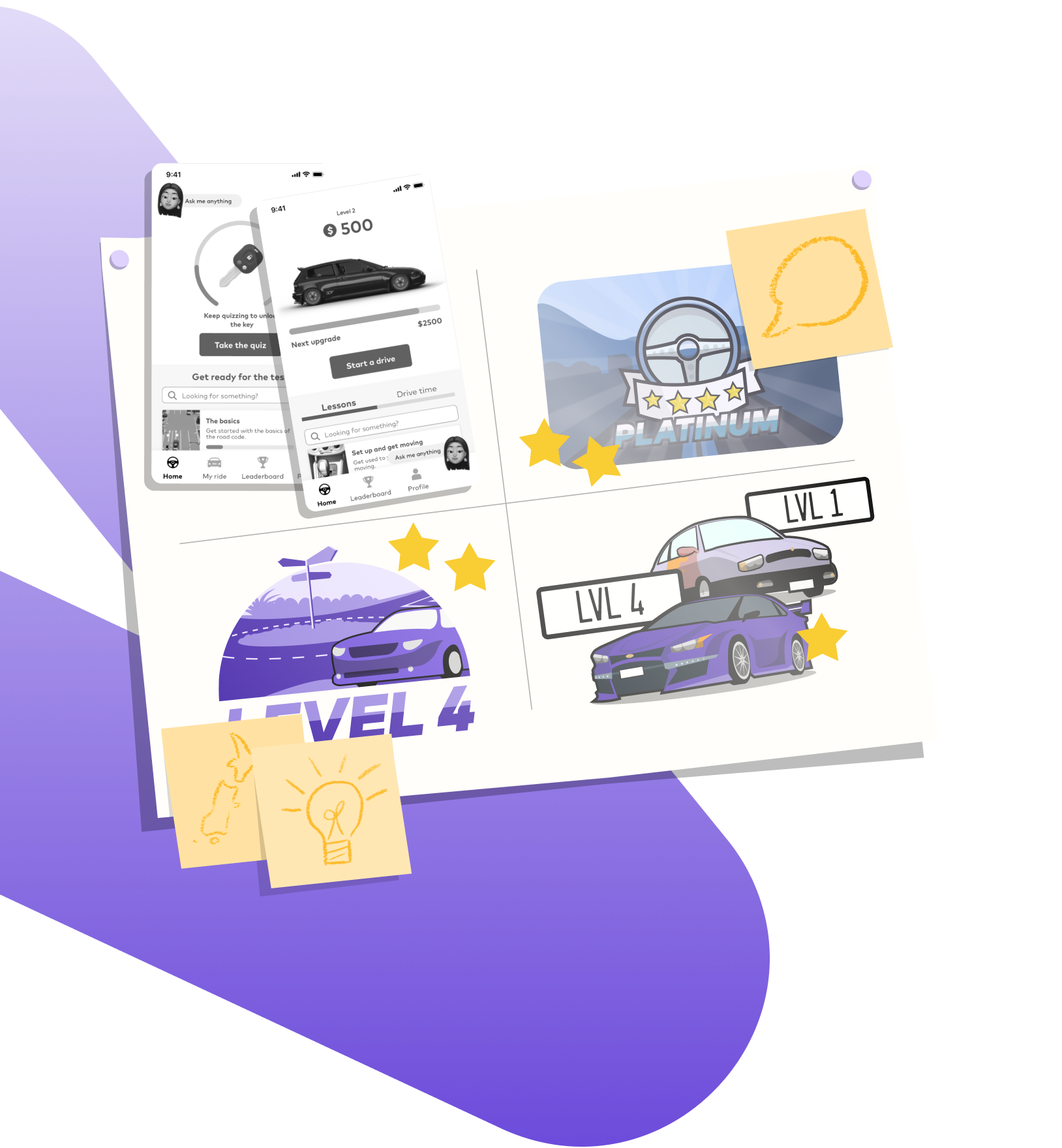
Our workshops gave us a better understanding of the value systems, learning processes, and preferred visual styles of our target demographic and we got to work making changes to the mobile app. Crucially, we discovered that learners do not typically complete the anticipated 120 hours of driving practice before sitting their licence, so we reordered the learning modules to prioritise skills most likely to help prevent accidents. We also modified the journey to suit either city or rural drivers.
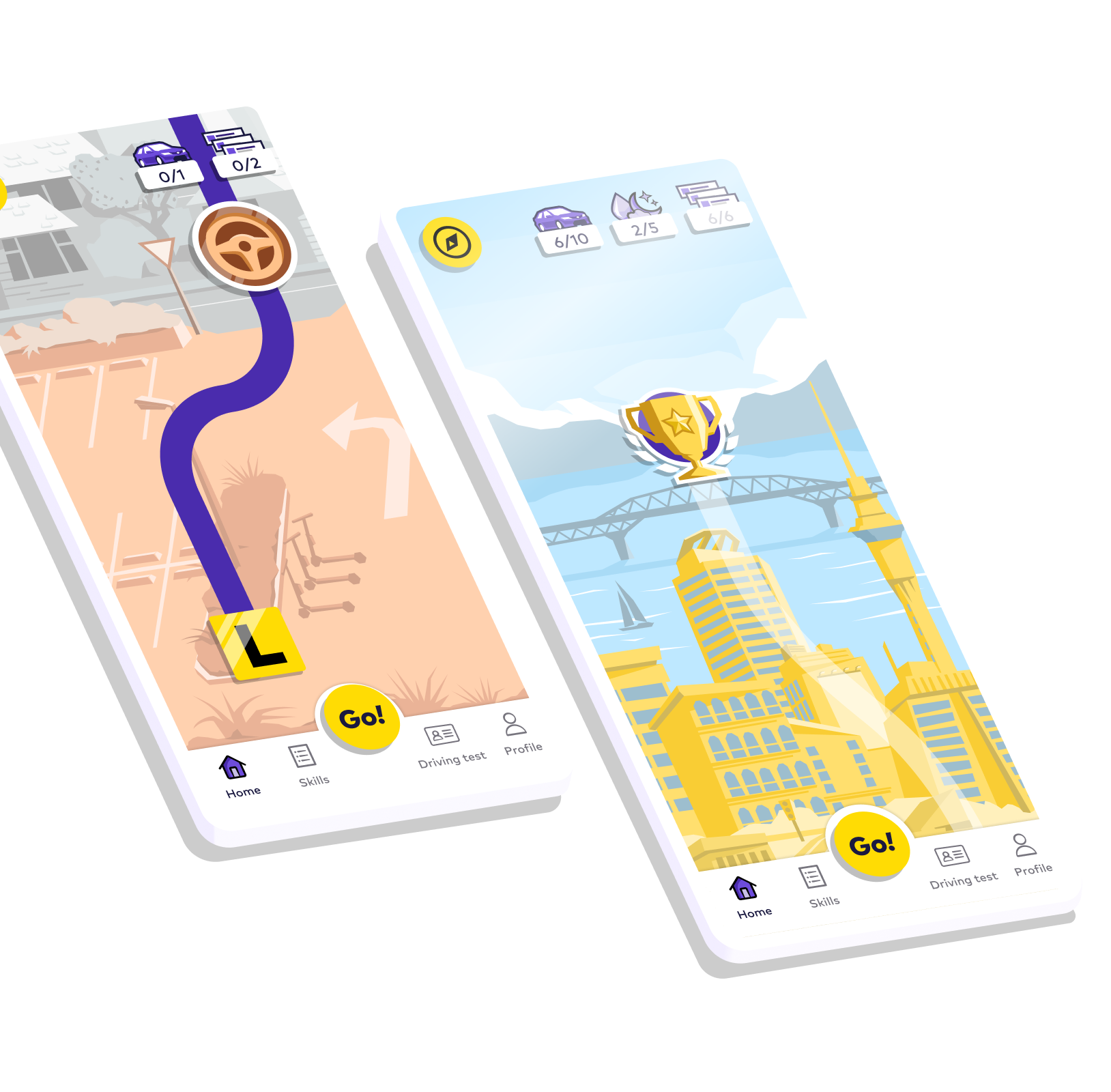
We discovered that young male drivers were goal-oriented and wanted to clearly see their progress so we visualised their movement through the mobile app as progressing along a road.
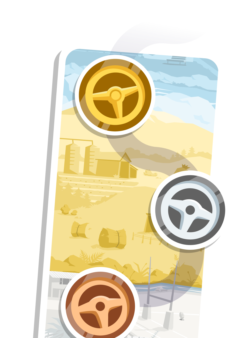
Being rewarded early was key to keeping them engaged so we stacked the rewards upfront to incentivise repeat use and created a complete set of award badges referencing pop culture with a New Zealand flare. We then streamlined the system for how they rated their skills after each drive, making it more intuitive.
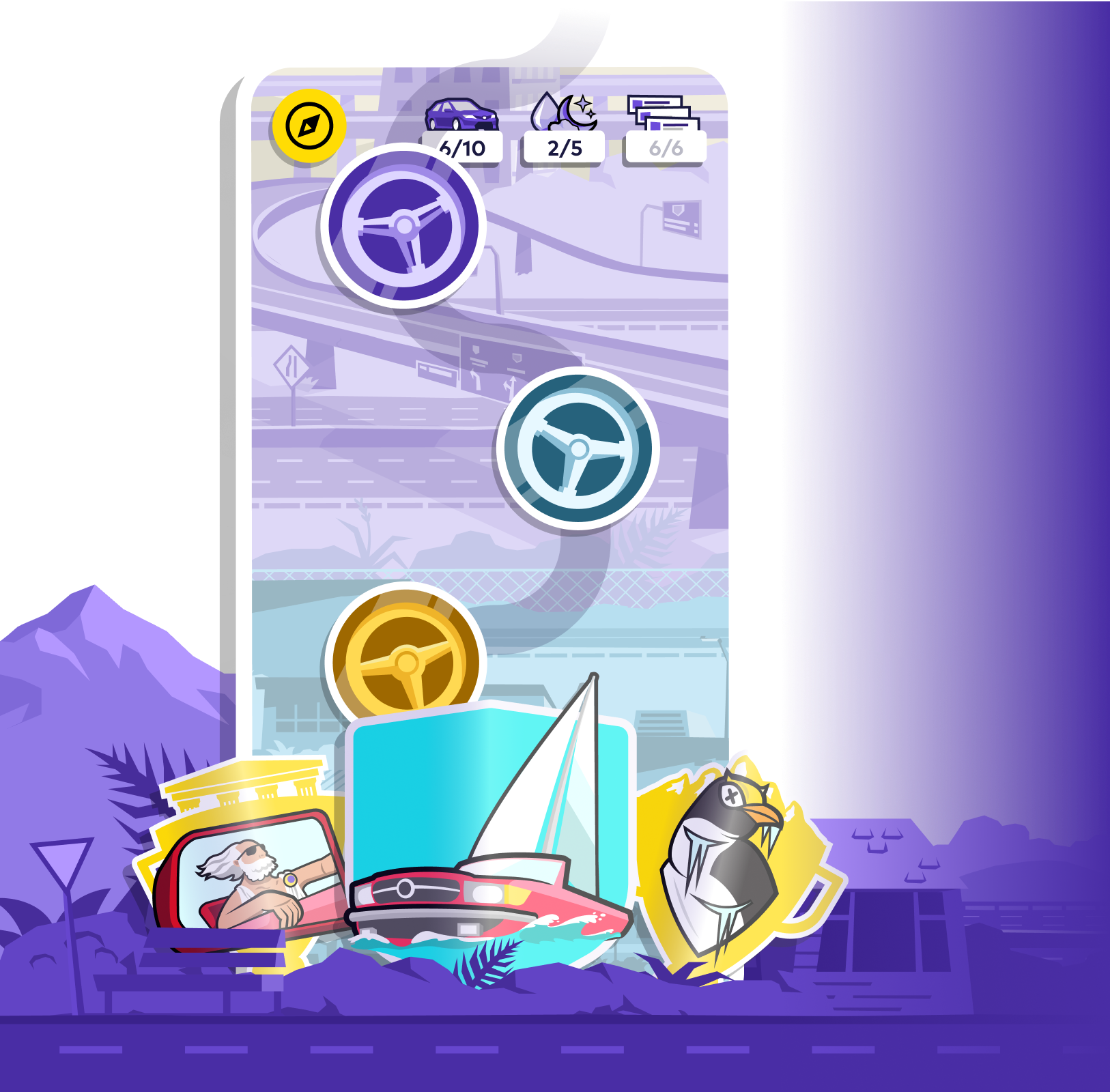
At every opportunity, we took the chance to inject emotion and heart into the interface. We moved to a free-form approach, breaking out of the structured style of cards and carousels
We opted for angular, graphic cut-out style imagery with bold punchy colours. And we threw in lots of animations - from large-scale rewards to flashes of interest at every corner.
A look under the hood
Our developers utilised their excellent technical R&D skills and devised ways to not only better engage the target audience but also increase their safety. This work included the layering of vector 'Lottie' animations to deliver dynamic interactions that capture the user's attention, and the introduction of geospatial analysis for critical driver error detection. They even retrained a machine learning model typically used for scanning credit cards to instead scan driver licences.
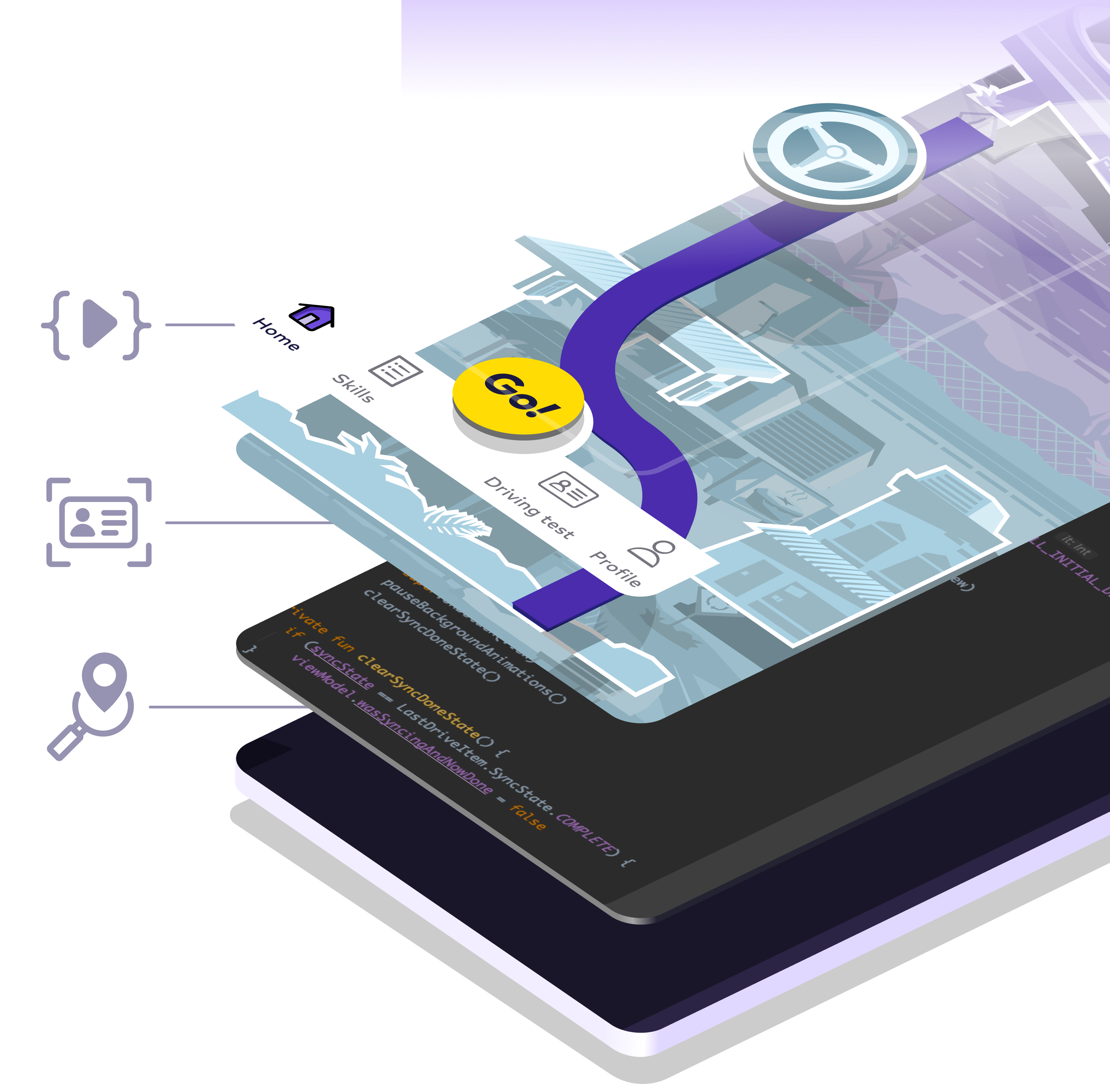
The full service
Drive Go 2.0 is a highly creative solution with gamification principles, style and language incorporated at every layer. Each decision was backed by evidence and the approach strongly validated with our target users. Drive Go is paving the way for a safer future on our nation’s roads.
