
Great Returns
Digital innovation, R&D & mobile app development
Alphero had an awesome six year relationship with Westpac, where we contributed across every part of their digital business - serving as their mobile development partner, supporting their digital design projects and operating as their innovation lab. From discovering new frontiers in digital financial services to delivering key products and services at pace, we helped Westpac become the digital leaders of the day - and we loved every minute of it.
It all began with an iPad app…
In 2012, Westpac asked us to create their first iPad banking app for New Zealand. The CEO’s brief was “make it better than Westpac Australia’s”- and deliver it within three months.
Although we were still only 18 months into our own business journey, we immediately stood up a team, began work within a week, and managed to deliver it a day ahead of schedule.
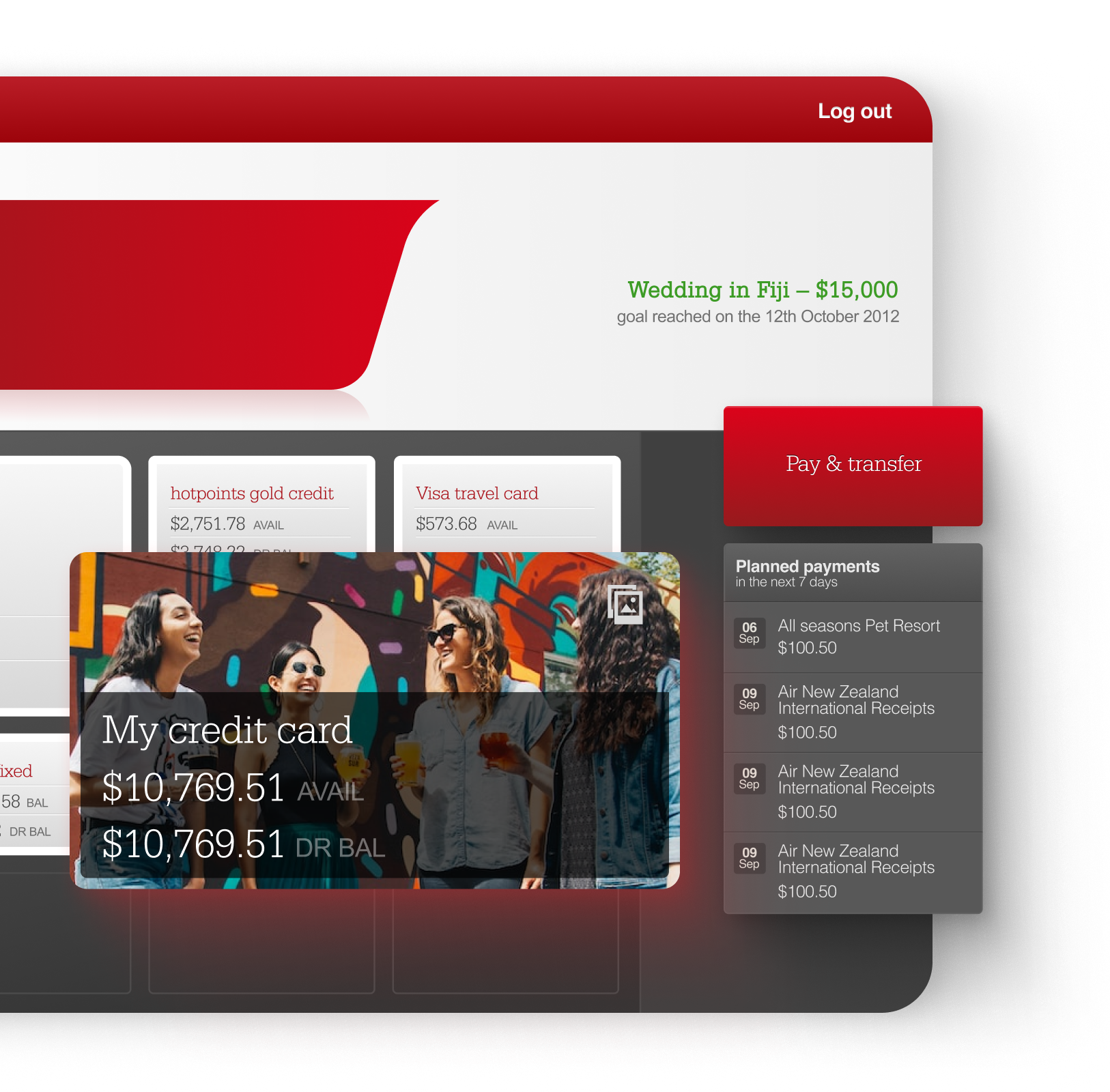
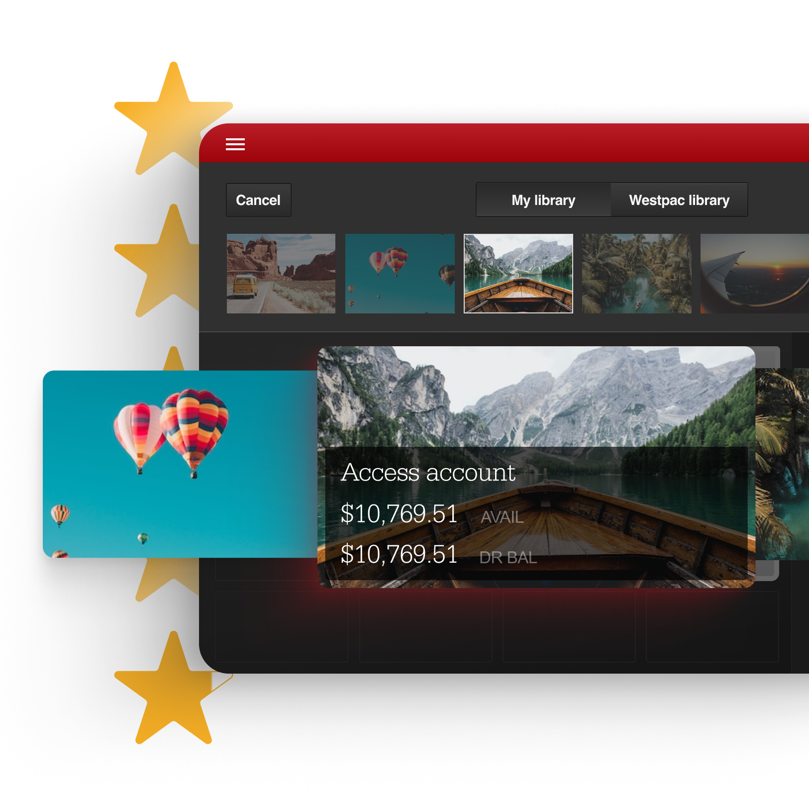
Despite having limited data available (from their 2012 APIs), we were still able to create a beautiful interface, with clever motion design and lush interactions - including giving users the option to personalise the grid with their own photos. This personalised approach meant that the grid was flexible enough to accommodate those with multiple bank accounts (up to nine) but still provided an elegant interface for those with only one or two.
The app was hugely popular with users, earned itself nearly five stars in the app store, and the team was thrilled.
...then an iPhone app
Their next step was for us to extend the code base to create an iPhone banking app, which also quickly shot to 4.5 stars. With our help, Westpac were firmly positioned at the forefront of digital banking experiences, with one of the top ranking mobile banking services in the app store in 2013.

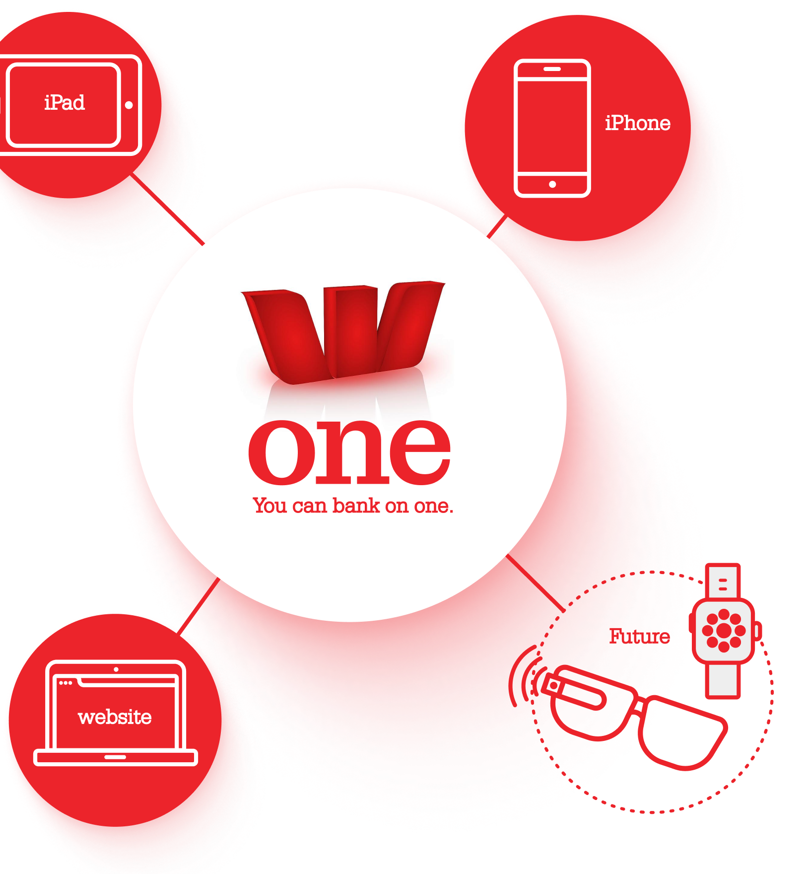
The speed at which successful mobile banking had been achieved, proved to Westpac it was possible to deliver effective digital services at pace. This prompted them to overhaul their entire online banking experience - the result of which was Westpac One. We supported this work by continuing to build out the native components of the new Westpac One experience and serving as Westpac’s mobile partner for the next six years.
But while we were helping to enable the products of the day, we were also exploring their possibilities for tomorrow…
Then a whole lot of future thinking…
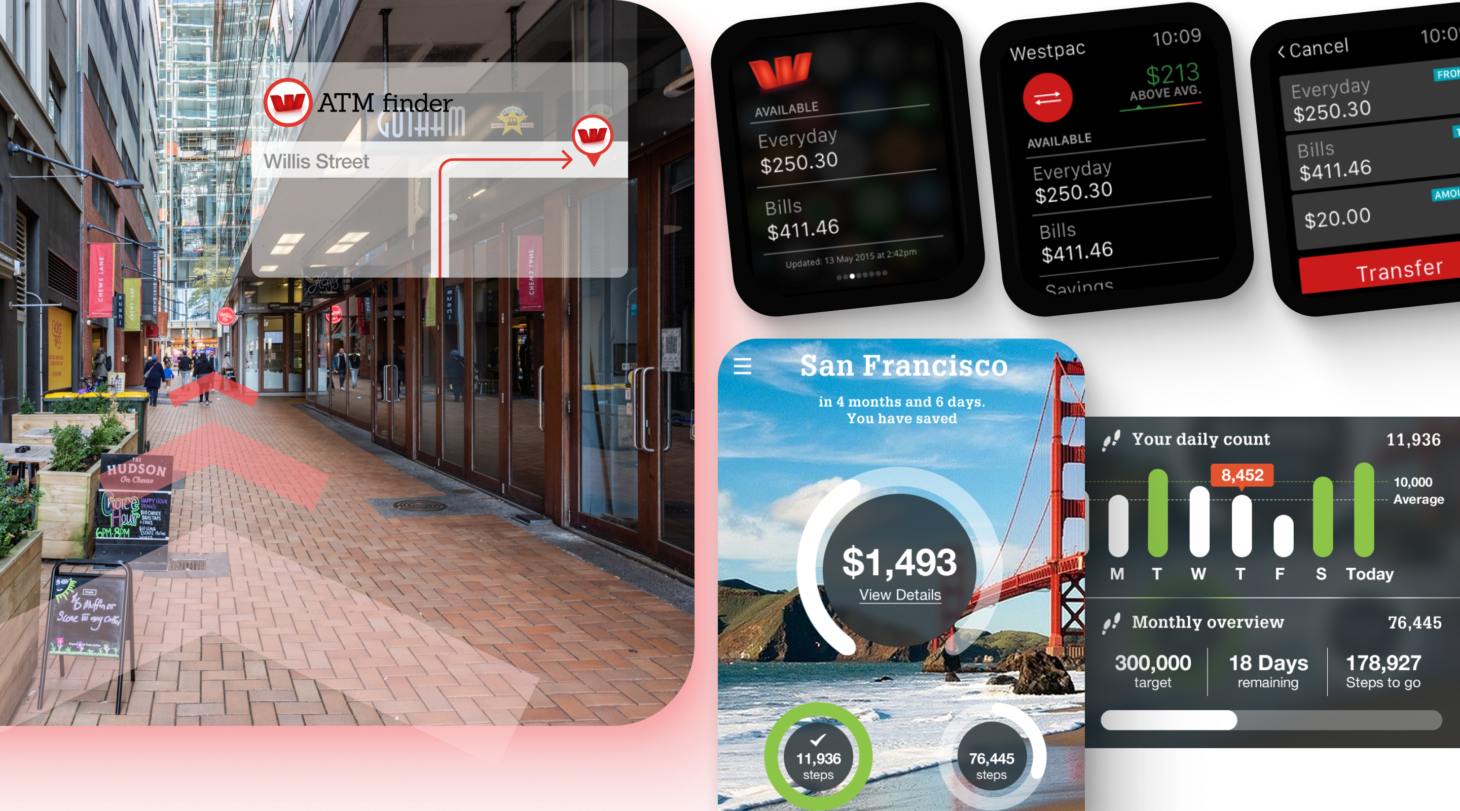
While Westpac One was happening behind the scenes, their chief digital officer wanted to keep exploring new areas of innovation in online banking. We dived straight in, investigating everything from the potential for banking with Google Glass, Smart Watches and Fitbits to the initial prototyping for touch id, and trialling augmented reality to do things like find the nearest ATM. In essence, we were now operating as Westpac’s own innovation lab.
Our knowledge of their existing systems and APIs, meant that we were able to experiment with each new doodad using real data, pulled through in a safe and secure way.
As a result of our explorations, Westpac became the first bank to get a watch app out with Sony and the second to get an Apple watch app released.
An app for kids...
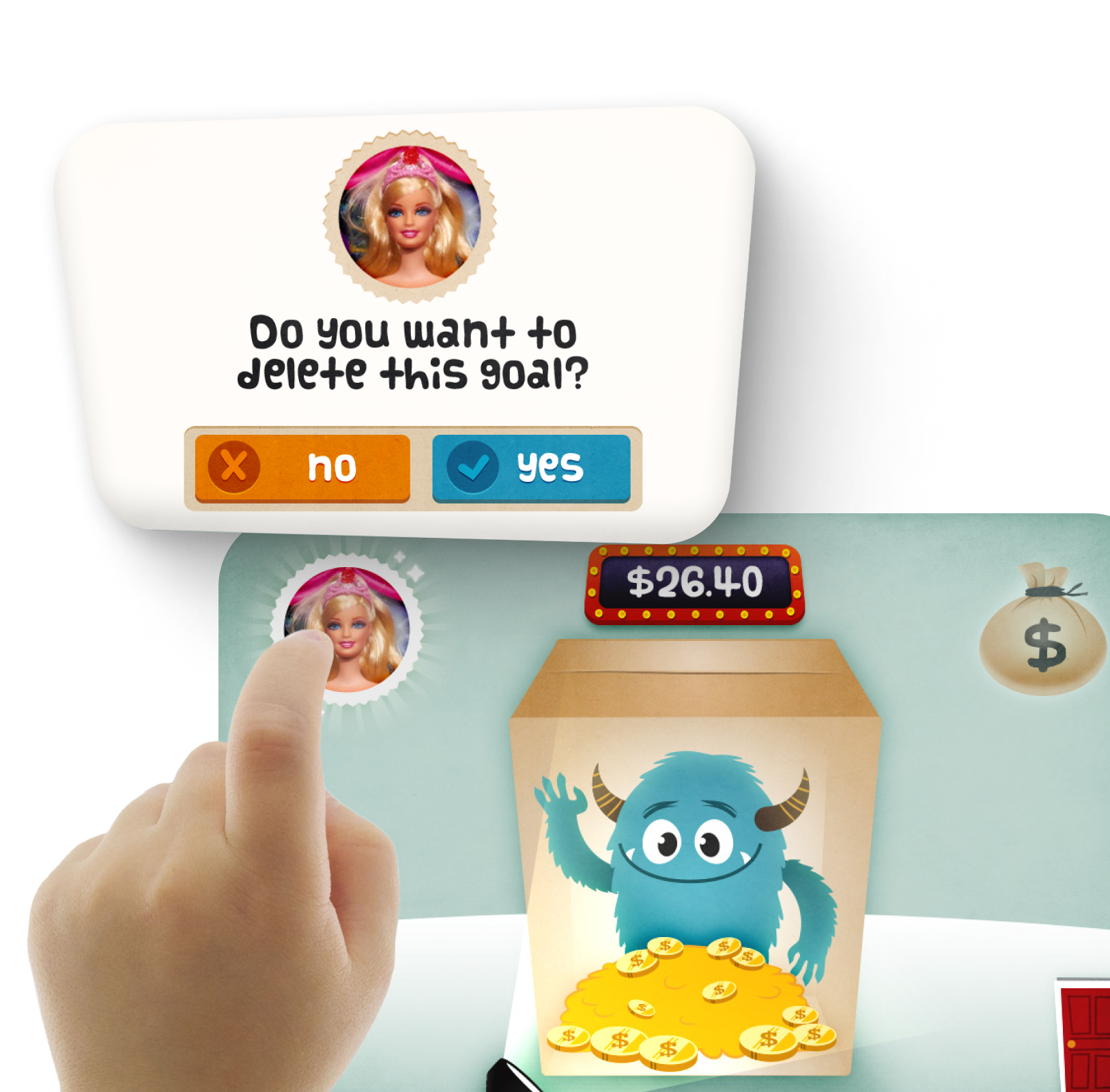
We also explored innovation at an opportunity level - looking for ways that Westpac could further their commitment to serving the greater good. A key aspect of this was improving financial literacy in the community - starting with kids. To get children motivated to save their pocket money for the things they really wanted, we designed a highly creative app called Cash Critter, which won them an international Tabby Award.
We began by interviewing kids, then used gaming software to produce an interactive experience involving a friendly monster and a growing pile of treasure. The app was integrated with a chores chart, and had both a kids’ and parents’ view. When a child tapped on the box, a torch would reveal how close they were to reaching their goal. They could then tap the left hand corner to see the toy they were saving for. During testing, one child shook the phone expecting to hear the coins clinking, so - not wanting to disappoint - we incorporated haptic feedback and sound to make that happen.
... and an app for their staff
Leadership Star was an internal initiative to help support a great working culture within Westpac. It enabled staff to anonymously feedback on how their leaders were living up to Westpac’s key leadership pillars - and for the leaders to receive that feedback and understand any changes they need to make.
To do this, we designed a system that sent surveys out to teams every two months, to capture their sense of how well these pillars were being exemplified. The system then collated the responses in specific dashboards - allowing leaders to see how they were performing, and HR to identify themes and trends. The platform utilised animations and interactions to display the data and was praised for the positive experience it created for staff. Once it was up and running in the business, we continued to provide support over the following years.
... the testing of concepts
Through all of this work we came to know and understand Westpac so well that we could be easily deployed to support any area of their business. This included helping them to rapidly test and evaluate the latest value propositions.
For example, we worked with Westpac’s cards team in the very early days of contactless payments. Our job was to investigate the concept of digital wallets, and look at how emerging global standards for mobile contactless payments might affect consumer experiences.
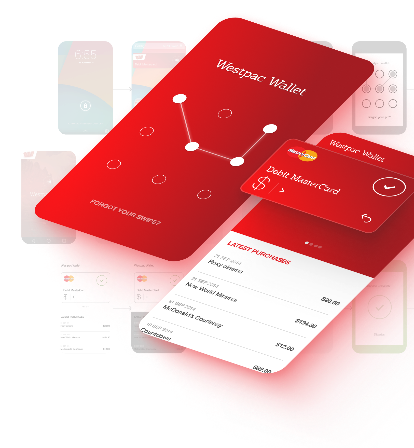
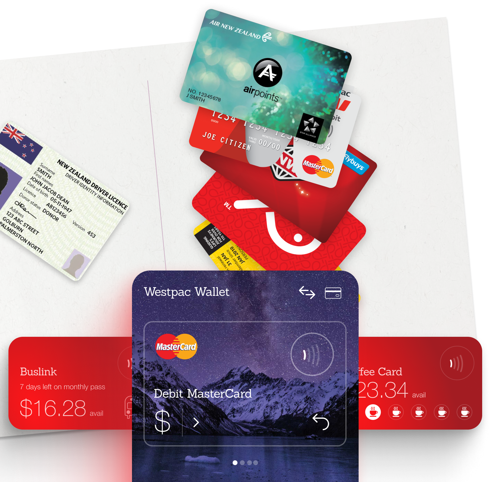
We wanted to understand if a digital wallet supplied by a bank should include more than credit cards, and if so, what other types of cards? We ran a research project where we asked participants to tip out everything in their physical wallet onto one side of a piece of paper; then asked them to move across the items they would want to keep on their phone. Contrary to the bank’s early assumptions, it wasn’t driver licences or IDs that people wanted to include, but their many types of store and loyalty cards. This insight was critical to reconsidering what a mobile wallet would need to include.
And the doing of designs
Beyond digital self-service, we were also on hand for a range of other design work.
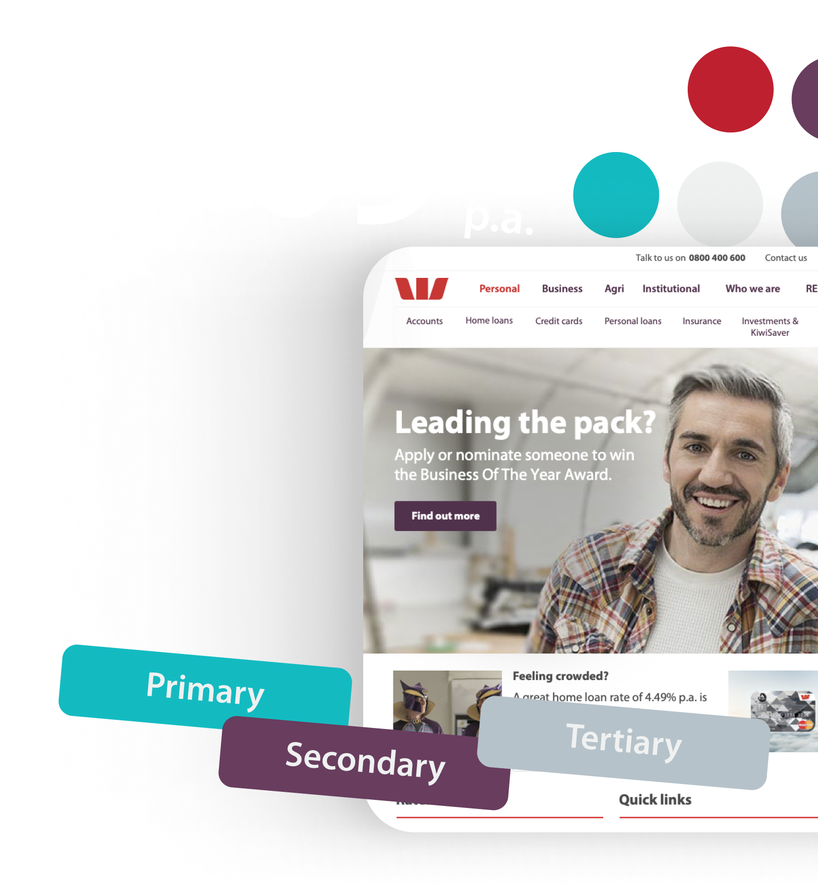
When Westpac went through a major rebranding process, we worked with their brand agency Principals to translate the new visual identity into the digital world, making sure the palette, typography and illustrations would all work for digital. We then rolled them out across their website, did touch ups in the app, and created pattern library for the team to use going forward.
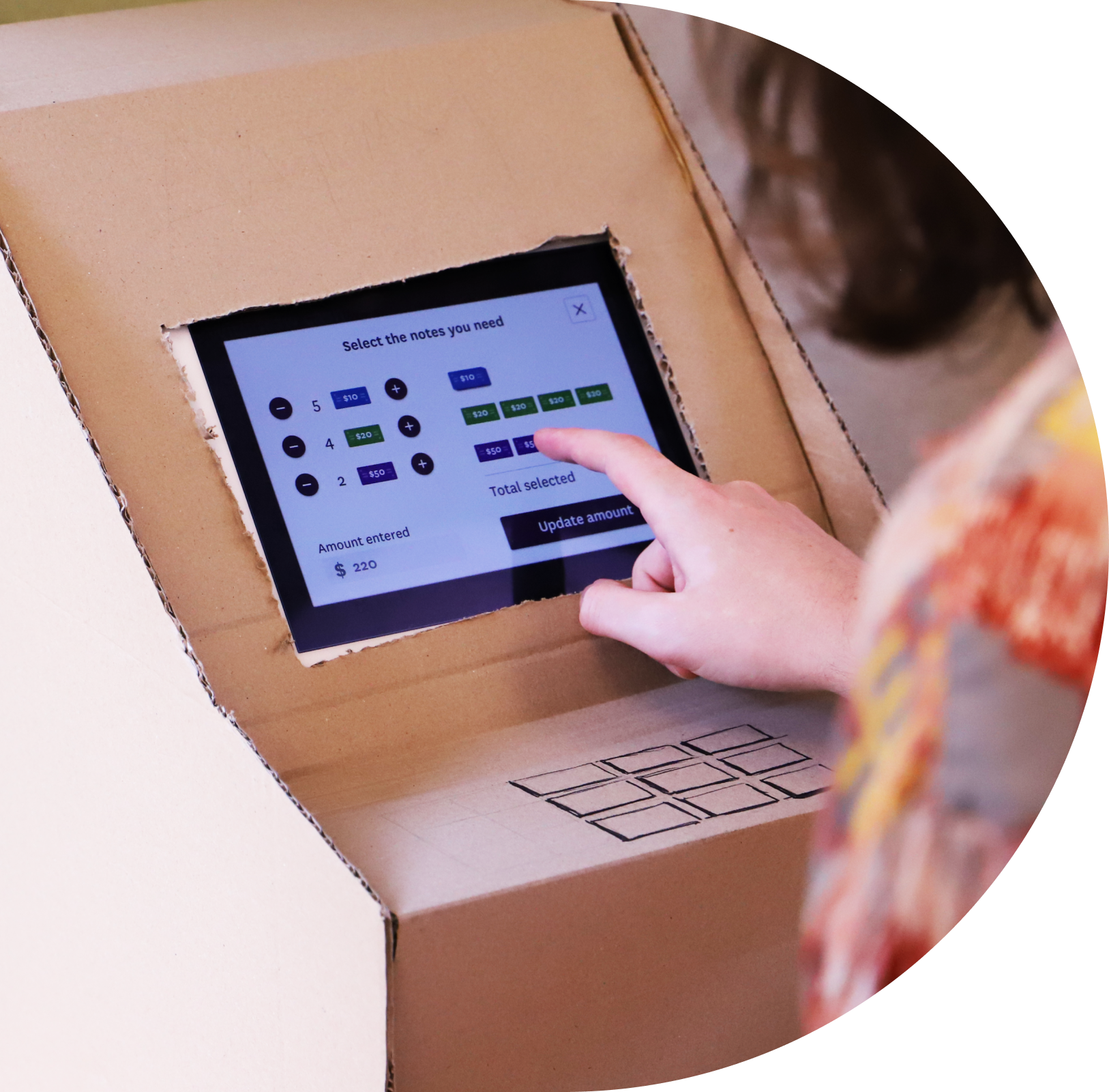
In the UX and UI space, we created a set of key customer onboarding flows, and did the screen designs for smart ATMs - which were the first ATMs to allow you to select which notes you wanted. We tested these with users by creating an ATM out of cardboard boxes and putting it in a branch in Levin for customers to trial.
Before closing a chapter
By 2018, with the adoption of scaled agile, Westpac had built its own in house capabilities for digital and it was time for us to sign off.
Our journey together had been long, fruitful and far reaching - covering much territory over many years. Throughout that time we were able to deliver huge amounts of value across their business, and because we were so familiar with their brand, their APIs, their values and ways of working, we were able to do it all in a cost efficient way. We’re super proud of what we achieved together and still consider Westpac an all-time great client.