Good Energy
Mobile app design and development
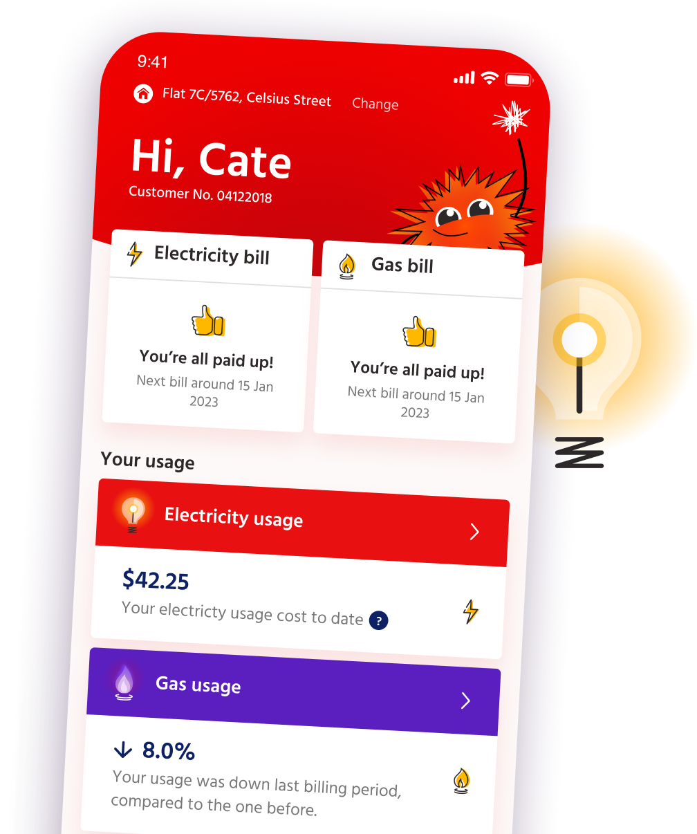
Red Energy is one of Australia’s leading power retailers. We partnered with them to produce their first self-service app, which would not only provide an exceptional digital experience for their customers, but authentically bring to life the personality and heart of their brand.
True blue
Red Energy is known for their commitment to their customers and have consistently been voted one of the most trustworthy companies in Australia.
They wanted to offer their customers more control over their account, without losing that sense of care and connection that their brand was built on. By commissioning us to create this app, they were effectively entrusting us with their most valuable asset - their reputation. Our job was to amplify this strength in a self-service context, and create, in the words of their CEO, a “jaw dropping experience” for their customers.
Creating with confidence
While Alphero has a strong pedigree in creating power apps, the Red context was unique. Not only did they have a huge customer base with many variables, across multiple states, but there were system level changes required too.
Before setting forth on the design process, we wanted to prove to Red that we were the right digital partner, and that we were there to listen and take on board the specific needs and values of their business.
The power of proof
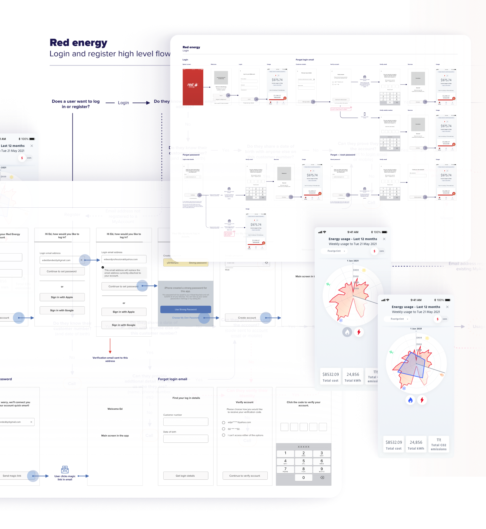
To do this, we began by standing up an initial proof of concept (POC), over the course of seven weeks. Using real information from their staff, we were able to show how they could provide their customers with secure access to their own data for the first time. More importantly, this exercise demonstrated our ability to collaborate successfully across their organisations and teams.
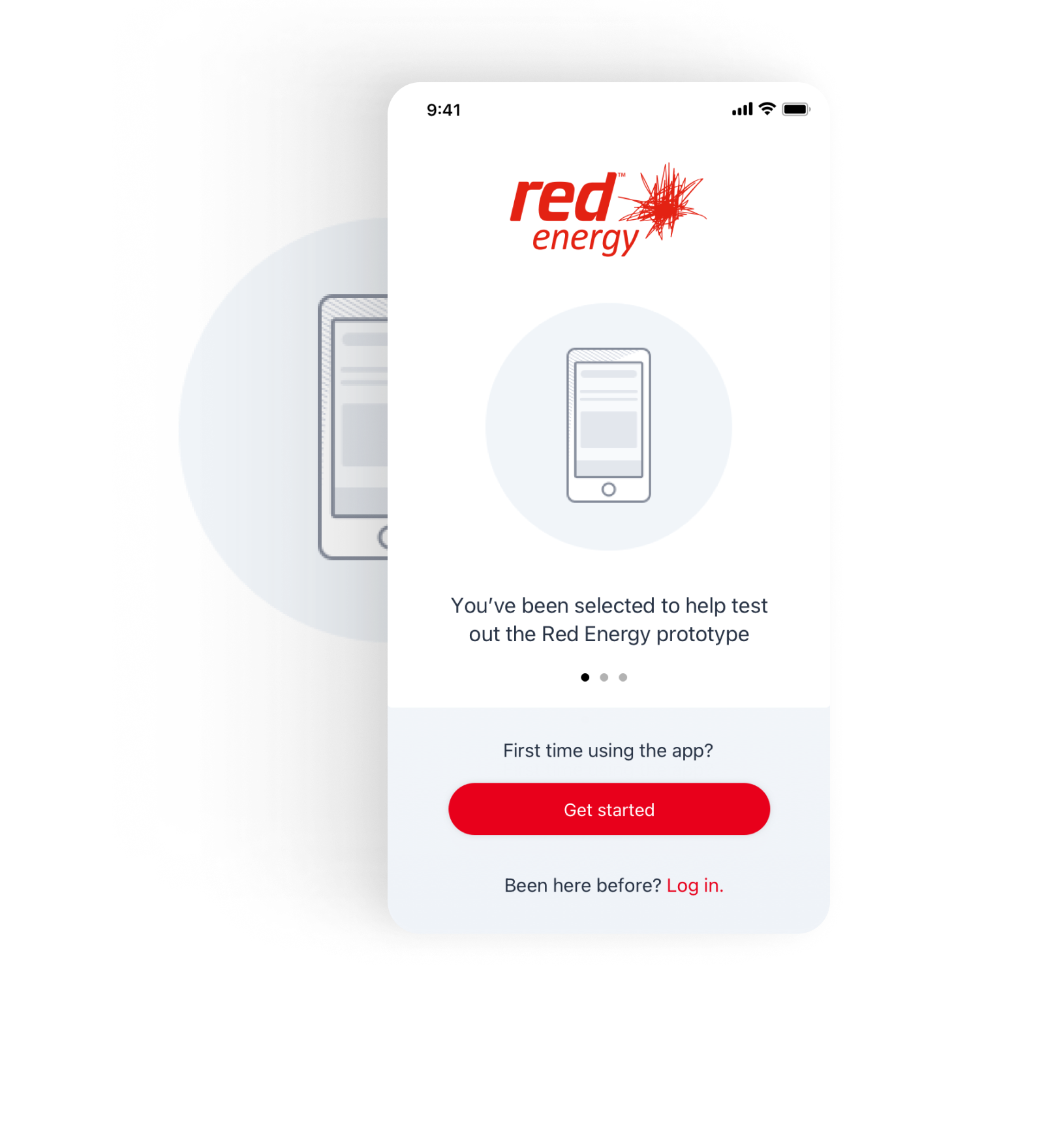
We then carried out a second POC to define the onboarding process. As the first entry point for customers, we knew this would set the tone for the whole app experience.
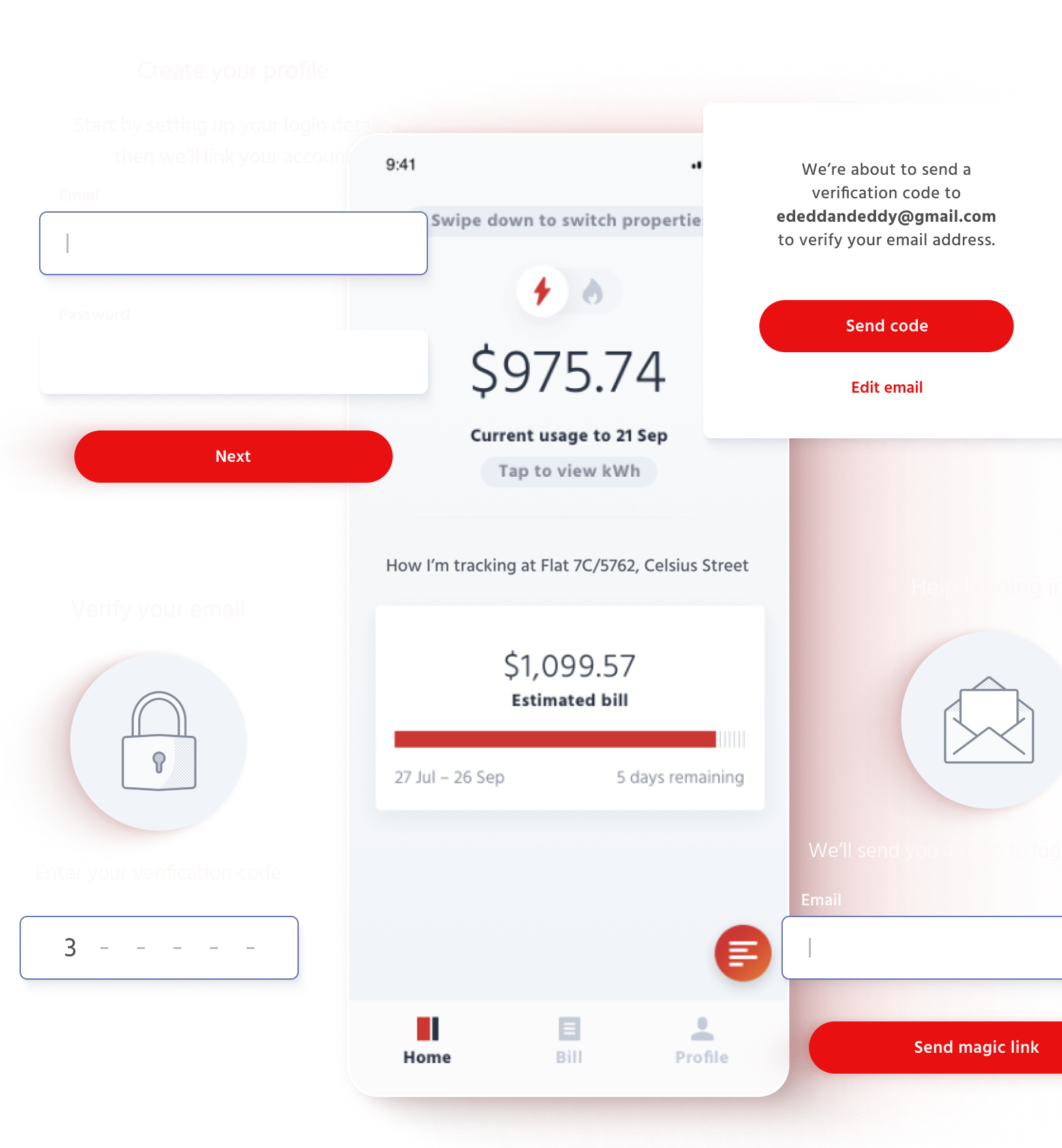
To get it right, we explored global best practice, while at the same time conducting in depth interviews with Red customers and staff. We then used high-level service design to visualise a process that would be as simple and as seamless as possible.
Armed with this information, Red was then able to implement the necessary changes to their backend, reconfiguring it to provide more customer-centric data, and paving the way for moving forward with the app.
Meeting many needs
Once we began the designs, we moved from working through internal complexity, to focusing on the varied needs of over a million people.
This included not only Red customers but those of their sister brand. And while the focus was initially on Red, we also needed to consider how both brands could ultimately operate from the same platform.
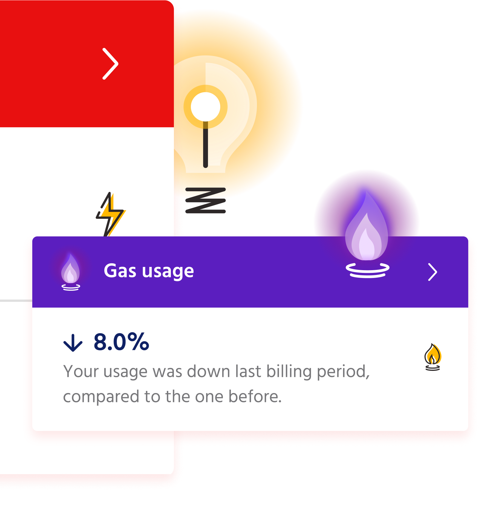
Through a series of workshops and iterative visual explorations we came to a best in class solution for visualising data - ensuring the app would feel personal and relevant to every user.
Bringing in the brand
Along with its great functionality, it was imperative that the app would radiate warmth and care, with a dash of fun and cheekiness too. It needed to be full of personality, in contrast to the homogenous nature of many self-service apps.
To achieve this we created a character called Bursty, who is born from their existing logo, ‘the burst’. Bursty brings a layer of delight, beyond the utility, while adding additional value to customers.
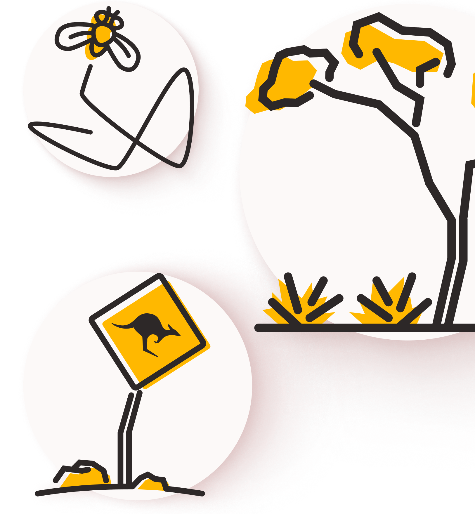
Alongside Bursty, we brought more magic to the app through the tone of voice and clever aesthetic touches - from the curtain lifting on key information, to the icons that reflect Red’s Australian identity.
Tuned in across the Tasman
Throughout the entire design and build process we continued to work closely with Red’s technical and business teams, collaborating daily between NZ and AU, as well as connecting into their customer base and running usability tests to ensure the designs were meeting needs and easy to use.
A “jaw dropping” result
Red is now providing an amazing new service to their customers with an app that sets them apart in the market.
And because the brand experience within the app has so successfully conveyed Red’s identity, the visuals are now being rolled out across other digital spaces and artefacts too.
Best of all, the app is now providing an exemplar, enabling us to roll out similar products for Red’s sister brand and provide even more customers with great self-service and a “jaw dropping” digital experience.
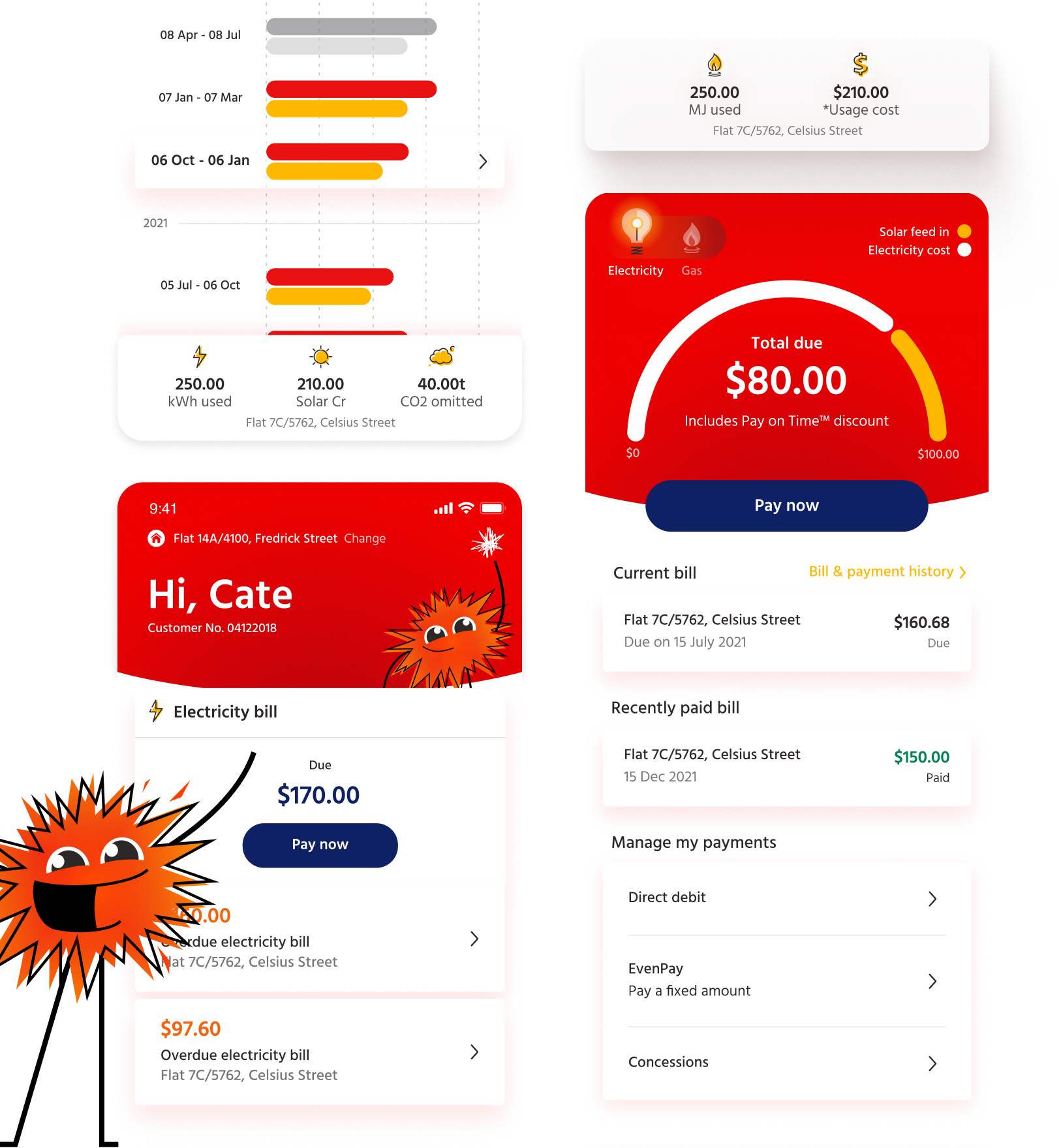
I just want to say that I’m beyond impressed with the app. Very smooth, simple to use, beautifully designed, and makes it so much easier to keep track of one’s consumption and upcoming expenses. Kudos to Red Energy! This app says a lot about your company and the people you have on board.
App store review